Rendering Trajectories from Points on a Map
As soon as we add timestamps to our (longitude, latitude) points we can sensibly assemble sequences of points into trajectories. Trajectories lend themselves to being plotted as lines on a map. We have provided a sample data set of fictitious trajectories between many of the world’s busiest airports for you to use.
$ python -m "tracktable.examples.trajectory_map_from_points"
    TRACKTABLE/examples/data/SampleTrajectories.csv
    TrajectoryMapExample1.png
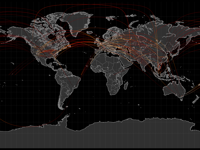
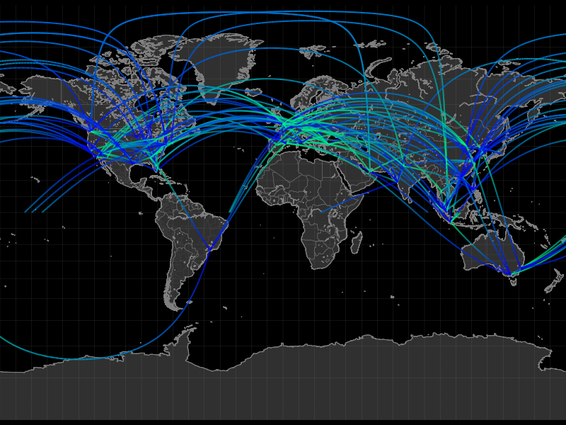
The trajectories are colored according to the ‘progress’ feature that ranges from 0 at the beginning of a trajectory to 1 at its end. However, the thin lines make them difficult to see with this resolution and color map. Let’s make the lines for the trajectories wider and change the color map.
$ python -m "tracktable.examples.trajectory_map_from_points"
    --trajectory-linewidth 2
    --trajectory-colormap winter
    TRACKTABLE/examples/data/SampleTrajectories.csv
    TrajectoryMapExample2.png
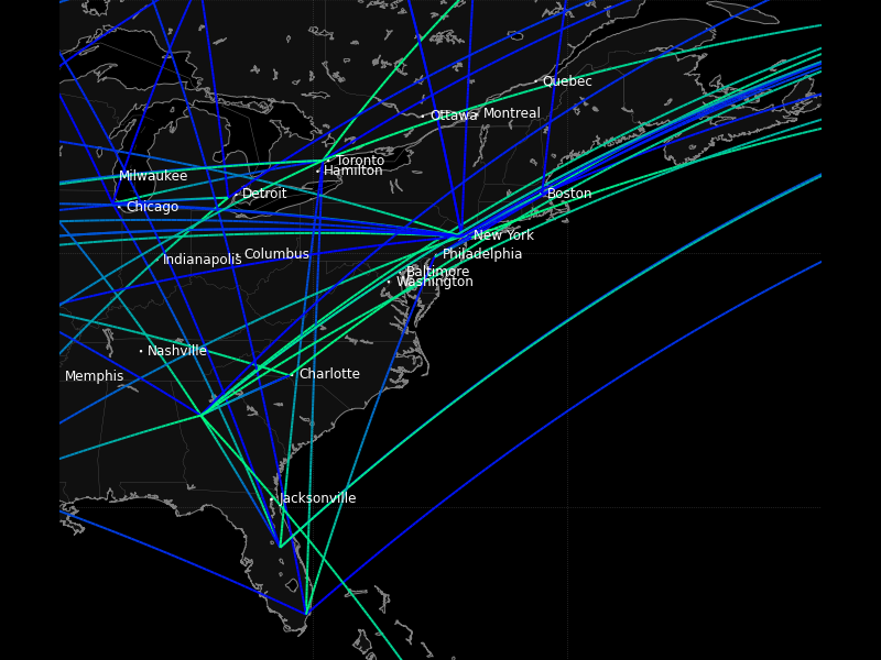
Just for the sake of argument, let’s zoom in on the eastern US. We don’t have a predefined map for that but we can come up with a bounding box. We want the region from (-90, 24) to (-60, 50). Recall that in our longitude-first convention that’s (90W, 24N) to (60W, 50N). While we’re at it, let’s also draw and label every city with a population over half a million people.
$ python TRACKTABLE/examples/trajectory_map_from_points.py
    --trajectory-linewidth 2
    --trajectory-colormap winter
    --map custom
    --map-bbox -90 24 -60 50
    --draw-cities-larger-than 500000
    TRACKTABLE/examples/data/SampleTrajectories.csv
    TrajectoryMapExample3.png
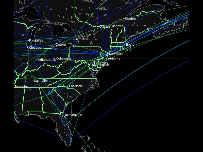
Last and not least, let’s highlight the borders of the US states and Canadian provinces in bright green lines 2 points wide. We’ll also decrease the trajectory width so that the city labels aren’t so overwhelmed. Don’t forget the backslash () in front of the color.
$ python -m "tracktable.examples.trajectory_map_from_points"
    --state-color \#80FF80
    --state-linewidth 2
    --trajectory-linewidth 1
    --trajectory-colormap winter
    --map custom
    --map-bbox -90 24 -60 50
    --draw-cities-larger-than 500000
    TRACKTABLE/examples/data/SampleTrajectories.csv
    TrajectoryMapExample3.png
This result is not going to win any beauty contests but you’ve now seen a few more options available to you. Tracktable allows you to change the presence, appearance and style of boundaries for continents, countries and states (US/Canada only at present). You can filter and draw city locations by population (given some minimum threshold) or by ranking. You can change the line style, appearance and color map for the rendered trajectories. All of this is explained in the Using Tracktable With Python and the Reference Documentation.
Cartesian Trajectory Map
Since the addition of point domains in Tracktable 0.8 we can use the same rendering code that draws on maps of the world to draw data in flat 2D Cartesian space. You need to specify –domain cartesian2d and –map-bbox x y X Y as follows:
$ python -m "tracktable.examples.trajectory_map_from_points"
     --object-id-column 0
     --timestamp-column 1
     --x-column 2
     --y-column 3
     --delimiter ,
     --map-bbox -100 -100 100 100
     --domain cartesian2d
     TRACKTABLE/examples/data/SamplePointsCartesian.csv
     trajectory_map_cartesian.png
Support for automatically determining the bounding box of the data and adding an appropriate margin is coming soon.