Rendering a Heat Map from Points
The simplest display type that Tracktable supports is the 2-dimensional histogram or heatmap. It requires points that contain longitude/latitude coordinates. The points can contain any number of other attributes but they will be ignored.
Run the example as follows:
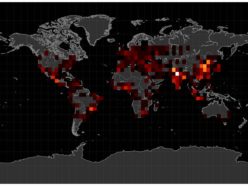
$ python -m "tracktable.examples.heatmap_from_points" TRACKTABLE/examples/data/SampleHeatmapPoints.csv HeatmapExample1.png
Open the resulting image (HeatmapExample1.png) in your favorite
image viewer. You will see a map of the Earth with a smattering of
red and yellow dots. These are our example points, all generated in the
neighborhood of population centers.

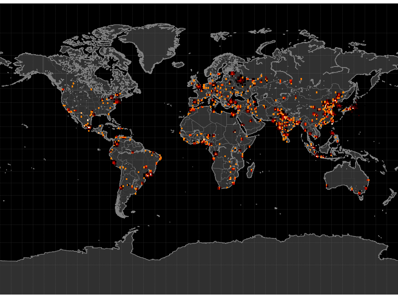
Now it’s time to change things around. Let’s suppose that you want to
see larger-area patterns with a coarser distribution. You can change
the histogram resolution with the --histogram-bin-size argument:
$ python -m "tracktable.examples.heatmap_from_points" --histogram-bin-size 5 TRACKTABLE/examples/data/SampleHeatmapPoints.csv HeatmapExample2.png
Perhaps when you open up that image you find that the bins are now too large. The earlier size was good but the histogram is too sparse. If you change the color map to use a logarithmic scale instead of a linear one you might get more detail:
$ python -m "tracktable.examples.heatmap_from_points" --scale logarithmic TRACKTABLE/examples/data/SampleHeatmapPoints.csv HeatmapExample3.png
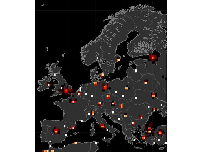
That doesn’t help much. What if we zoom in on Europe and make the bins smaller?
$ python -m "tracktable.examples.heatmap_from_points" --scale logarithmic --map europe --histogram-bin-size 0.5 TRACKTABLE/examples/data/SampleHeatmapPoints.csv HeatmapExample4.png
There are many more options that you can change including map region,
point domain (geographic or Cartesian), decoration, colors, image
resolution and input configuration. You can get a full list of
options with the --help argument:
$ python -m "tracktable.examples.heatmap_from_points" --help